Author’s Note: (092220) Figma recently announced a few new features that make the approach done in this article as outdated. Figma will soon support Variants and Interactive Components, which greatly simplifies the use of components.
I learned about Brad Frost’s Atomic Design around the same time Figma was going to beta in October of 2016. After Figma added components to their feature set, I was excited to see how I could apply the atomic model using Figma components.
At that time our company used a Visual Design Library (VDL) that contains several hundred components and associated patterns, so as I was creating mockups with Figma I started creating components for re-use. At first I did this without using Frost’s idea for organization, but once a team library feature was added to Figma I started over, building atoms, molecules, and organisms. In our case we could use templates as well, although pages were not necessary.
As a recap, here’s a diagram from Brad’s site:

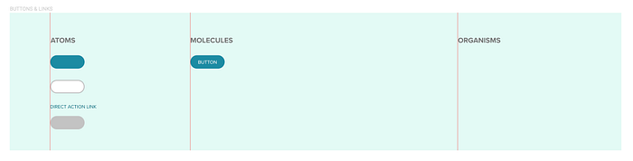
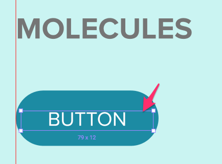
A good example is the button component:
- An empty button shape is an atom.

- A single text style type is an atom.

When you add these together you get a molecule (molecules being combined atoms).

If you start combining molecules with other molecules you build an organism in Frost’s model:

Note: I messaged Brad Frost because I was not entirely sure you should use atoms in combination with molecules to create an organism, and he kindly replied. As I suspected, do whatever makes sense in your design system. You can use whatever combination of elements (atoms, molecules) make the most sense in the structure of your organisms. Some companies don’t use more than atoms and molecules in the construction of their design systems, others use all the parts of Brad’s model.
And if you start combining full organisms to create dialogs, for example, you get a template, which is where the atomic model “strays from pure science”, but it suits the purpose. A template is where “we get to see our components come together in the context of a layout.” (B. Frost — Atomic Design)
To describe Pages, I’ll use Brad’s description: “…we see the final product, complete with real content poured into it, which helps ensure the underlying design system comes together to form a beautiful and functional UI.” (B. Frost — Atomic Design)
That’s as far as I want to go describing what Atomic Design is all about, I highly recommend Brad’s book if you want to really delve into its application for your work. It is a great resource if you are embarking on the creation of a design system as well.
So how does this all work with Figma? Like Sketch, Figma uses symbols they call components (which works better as a descriptor for the atomic model), to let you build instance based objects that can be combined (nested) in any way to let you make a change in one place and effect the instances across your design files. When I first discovered this in Sketch years ago I was thrilled and immediately started creating a design library (at the time being the solo UXD). I was also using Illustrator at the time when they just added cross-file symbol updating as well.
UPDATE: At Config EU, Dylan Fields keynote revealed some exciting new features such as new Instance Swapping, Variants, and more, doing which they managed to reduce memory load by 2000%!

But along came Figma and I just loved the simplicity of the UX after suffering some really irritating loses and plugin breakdowns in Sketch. And the performance of Sketch’s canvas seems to have suffered over the years, Figma is very fast and works well with my frenetic work style. (092620: And the recent 2000% memory reduction can’t hurt.)
Figma uses team libraries like Sketch and Adobe XD to let you share the components across your team’s design files. This is ideal for building what we need for atomic design. As for Sketch, I’ll give them credit for adding a team feature, but there’s no substitute for live sharing of file data, especially when the files can be embedded and never want for an update — everything is updated when you change the original file.
Note: If you do use live embedding in Figma, which I wrote about for Confluence in this article, you will have to remember to treat live embedded files as sacrosanct because you don’t want stakeholders to be unaware of changes (sanctioned or not) that happen when you edit an embedded file. I have tendency to play with designs so I just had to make sure we have component files that are carefully controlled, which is easy by setting permissions in Figma.
The Setup
So to recap, I wanted to apply the atomic model to the design libraries we use at ADP’s Next Generation Payroll group. Figma uses files to store components so setup and organization is simple.
Step 1 — I created one Figma file in a team project to hold the entire design library (what we call our Visual Design Library or VDL).
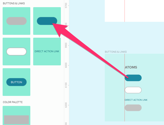
Step 2 — Then I added frames (similar to artboards in Sketch and AI) to contain each of the atomic elements as shown here:
I added the red guides and headings to each section of the frame for some organization, and color coded the frames to indicate their status (white = not started, orange = WIP, and green = complete).
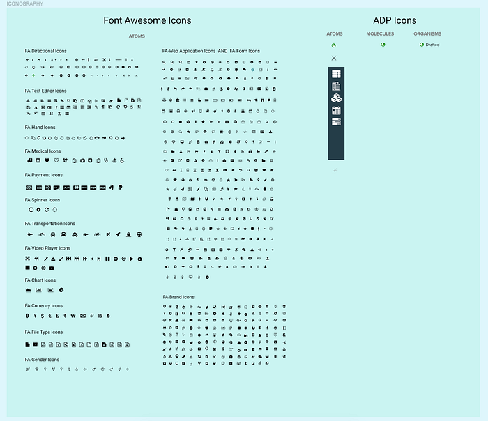
Another example is the frame I used for the iconography of our library:
One of the cool things you can do in a component based system is to group together states of various controls — for example, the five states of a badge can be stacked together and represented in one component:
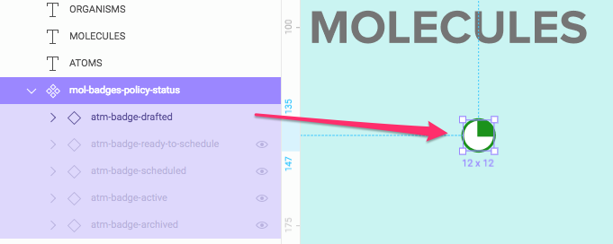
When using the Figma components in designs, the designer or design system can turn on and off the desired state based on the logic in the application. For the UX Designer just using Figma to create mockups, it makes the library smaller and easier to manage.
Step 3 — I started creating my components (buttons, input fields, etc.) using the color component swatches as my base. For example to create a button, I used our default button color and added an instance of the color to the buttons frame in my library file.
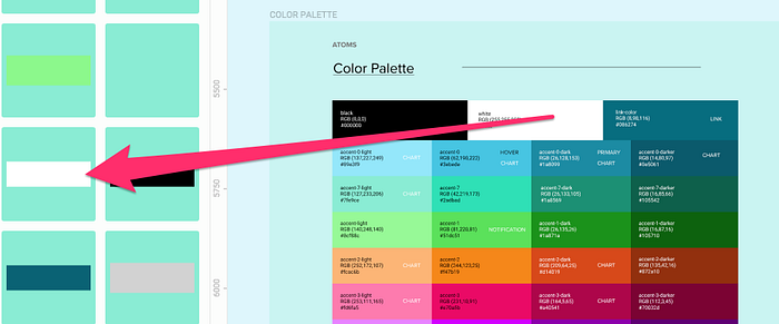
All I had to do was drag out a white color swatch instance, change it to my desired button color, resize to our button size, and give it a radius (in our case 100 because we use pill buttons).
As part of this step I was creating molecules as well, for example, the button with the label on the left above. Each time I made sure:
- adjust the label size to allow for label string length changes
- center the text to make sure it stays in center on width changes
- add any constraints to make the button label behave on resize
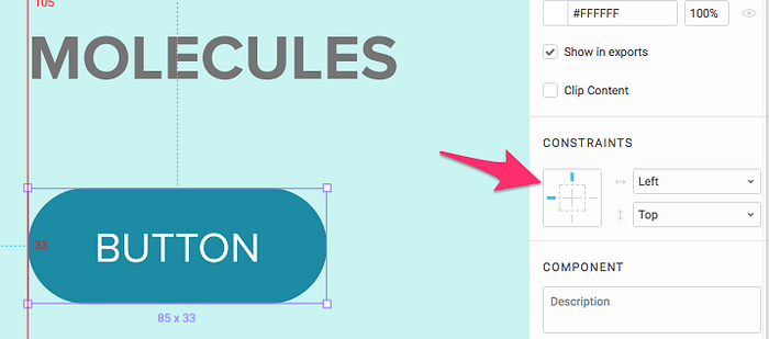
So when the button resizes after being used in a design, it’s flexible enough to allow for any placement.
To make this component even more powerful, I created color component based “states” for the button and added them to this button component. For example, we use a white-face button for secondary use, and a gray-face for disabled states. All I did was stack them together in the components file as shown.
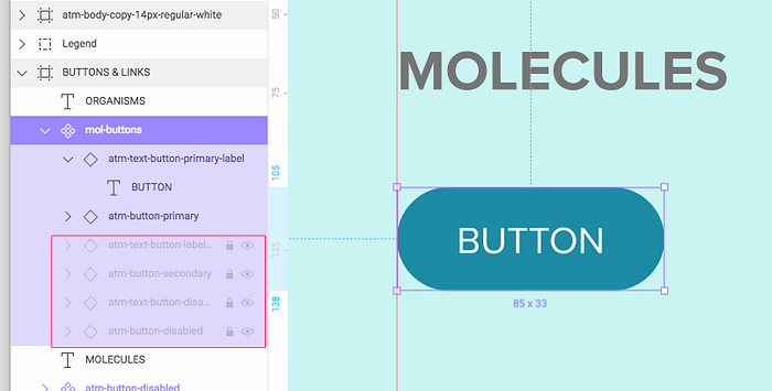
I make the secondary and disabled states invisible and locked just to make it so drilling down to change a label, for example, doesn’t select the other states. And when I need another style button, I just turn on and off the states as shown.
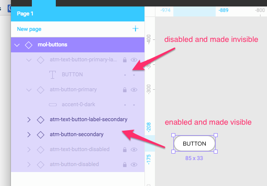
After the button is added to a design file, you can simply alter it’s component layers to get the desired button.
You can use the same approach to input fields, accordions, alert boxes, etc. so one component can be quickly altered to represent many. (Note that in Sketch this is done with the use of masks and overrides, and there are pros and cons to both design tool approaches to this work.)
Summary (or as far as I go for now)
I hope this helps the reader understand one approach to creating a flexible component system in Figma, I’m sure someone will poke holes and explain a better way — please do! But until Figma has more granular overrides for component properties, this seemed to me to be the best approach.
